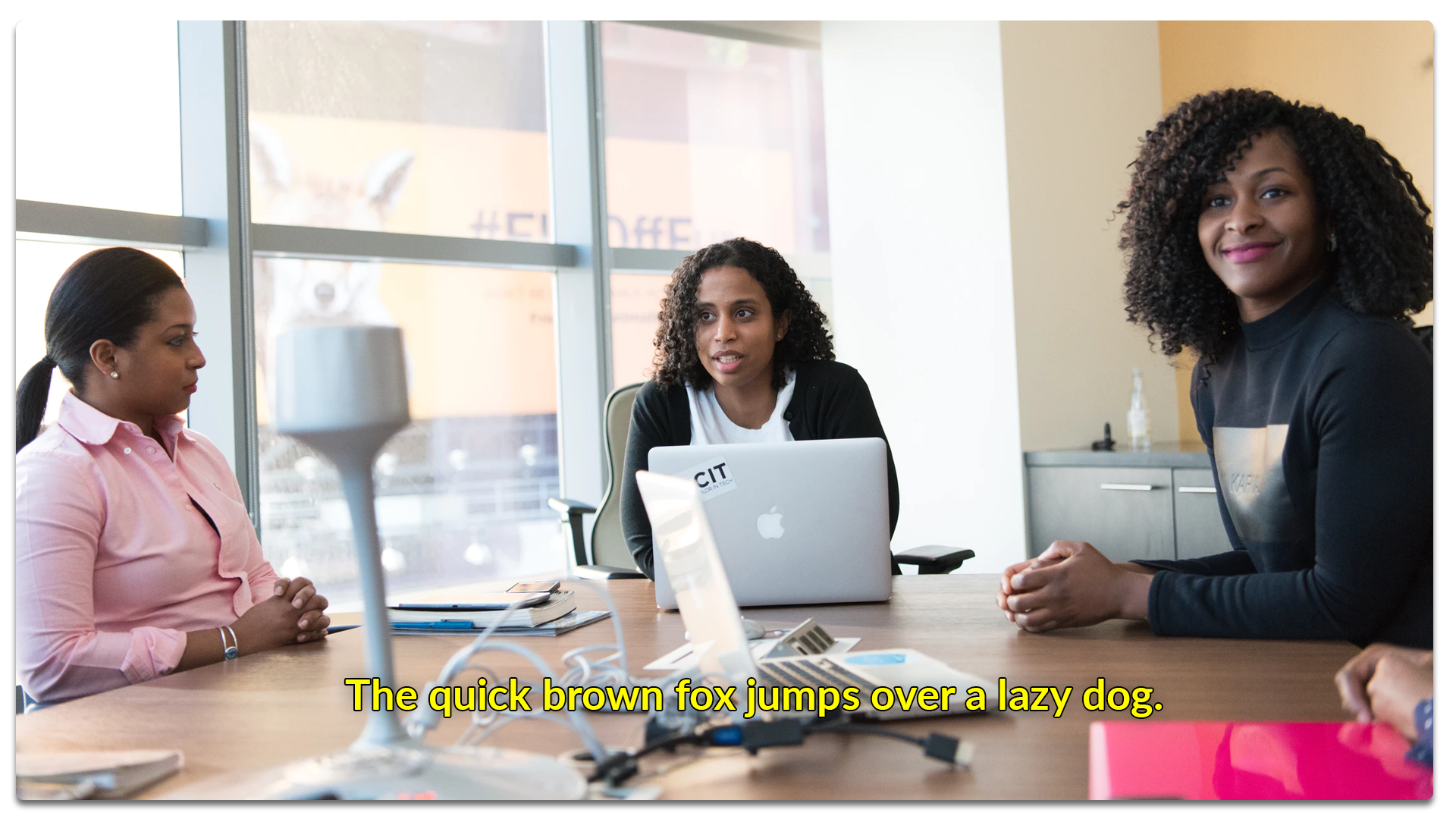
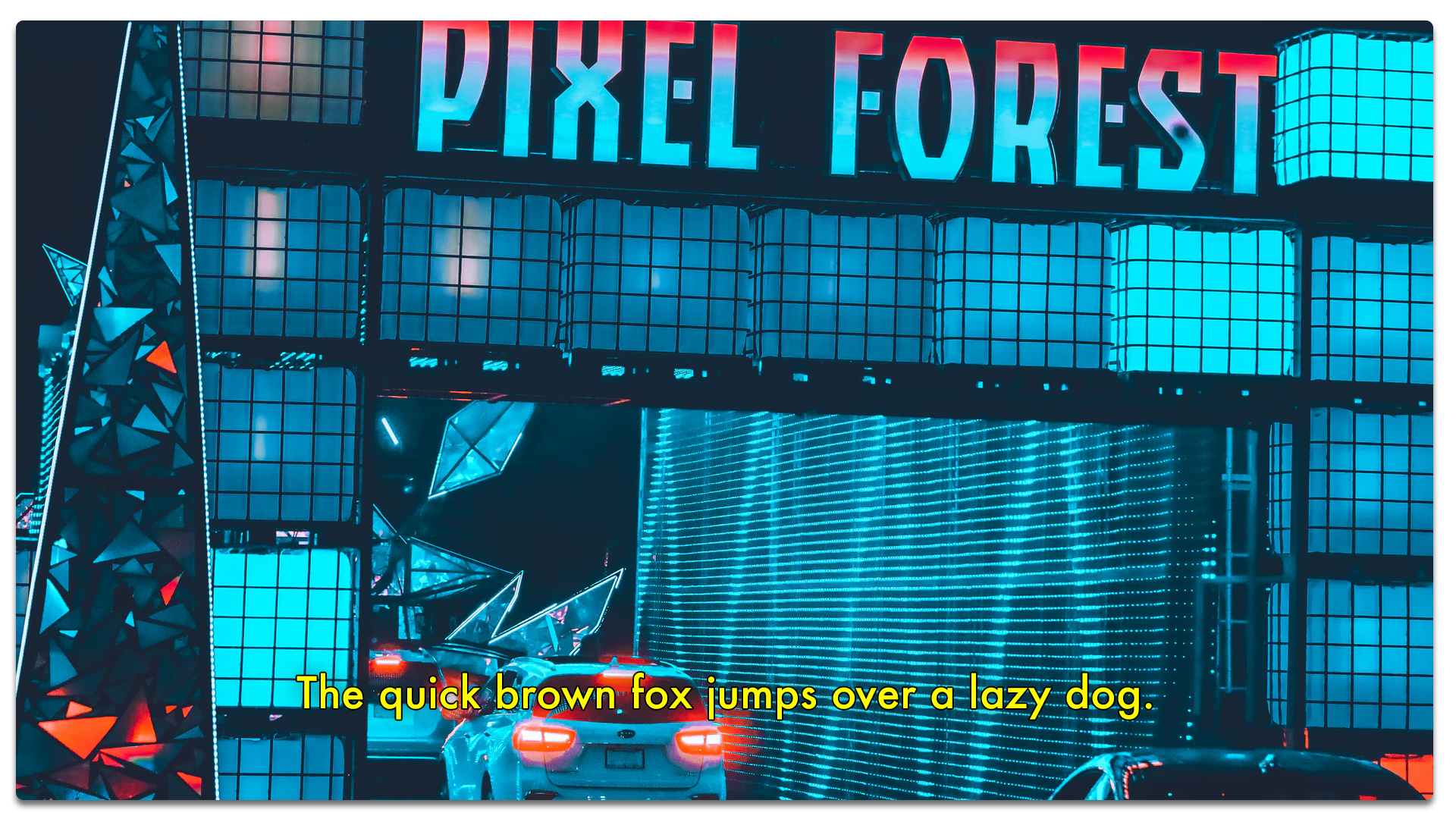
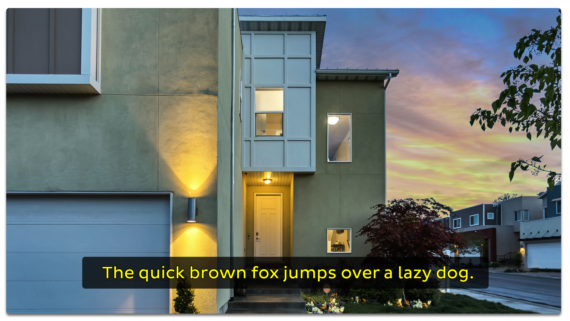
As content creators, not all of us are on board with the idea of "cluttering" our videos by adding subtitles to them. Or maybe we just feel like we don’t have time to add them. And in doing so, we turn down the benefits of added engagement to our content.
Subtitles help viewers understand the video (even without any sound). That's why adding them and making sure you pick the best subtitle font for readability helps you increase engagement.
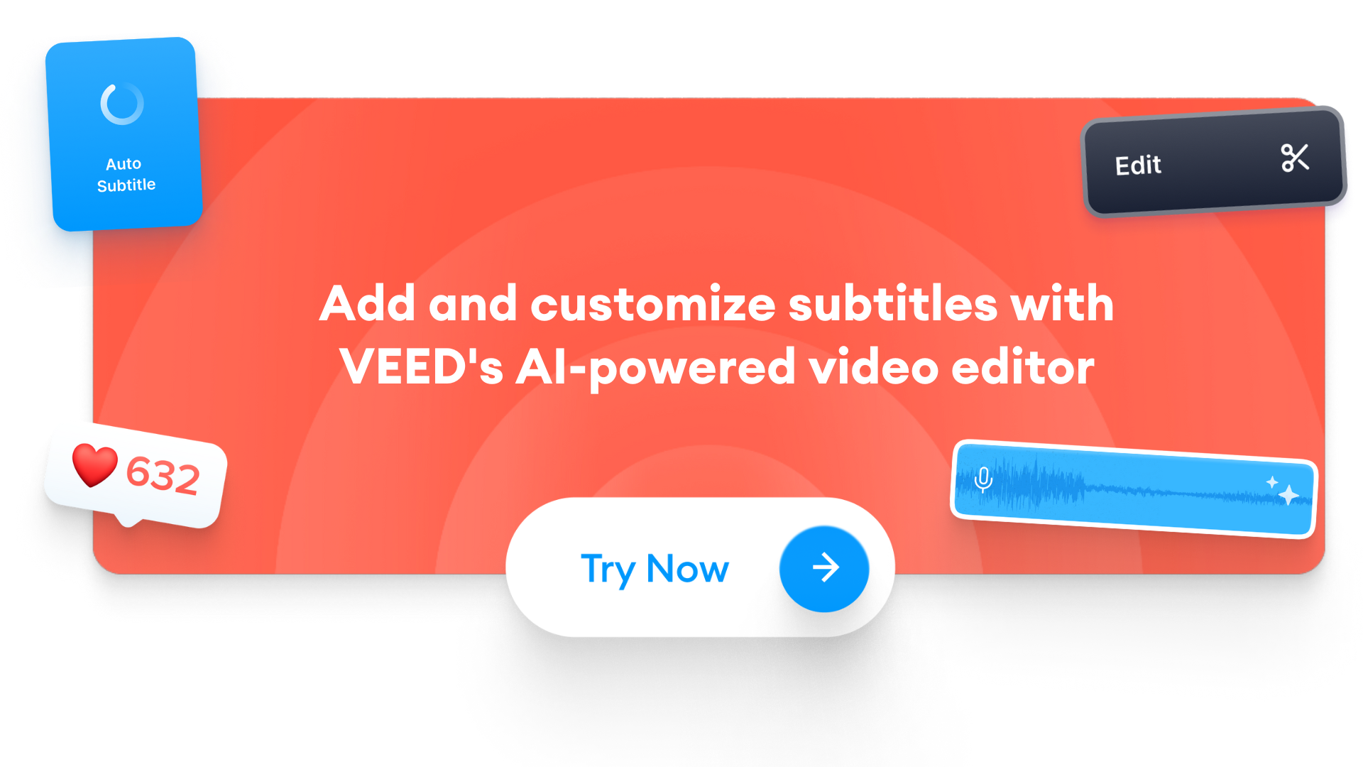
This guide is going to share the best subtitle fonts, best practices, and how to add them to your video in the click of a button using VEED.
Top 12 Best Fonts for Subtitles

[#TOC1]1. Arial[#TOC1]
Best for video presentations
The standout feature with Arial font is that it's something that’s equally good for a whole range of different purposes.
Arial belongs to a versatile family and is great for writing reports with, creating presentations, for use on digital magazines, for use in newspapers as well as for running advertisements and promotions. Arial is a Swiss font. A country that specializes in efficiency and neutrality. No wonder the Arial font embodies these characteristics.
If you want a simple font, Arial might just be a perfect choice, because it’s so commonplace.
For captions and subtitles, you ideally don’t want anything that distracts people from the goal. When you edit large videos, you can also use Arial Black, but it can feel a little heavy with letters placed so close together when you have longer sentences on the subtitles.
Other versions of this font include Arial Regular, Arial Narrow, Arial Italic, Arial Bold, and Arial Bold Italic.
[#TOC2]2. Helvetica[#TOC2]
Best for a clean and polished look
Helvetica continues to grow in popularity as one of the most used fonts of all time. Designers say Helvetica is like water. The description fits the font owing to the versatility it offers. Designers love it because it imparts a unique look and feels to the design in addition to making the work much more attractive as well as stylish.
Since Helvetica was first launched in 1957 new weights and sizes were introduced to meet growing demand. Minor touches like a hairline version, a bold weight, and more kept being added and extras led to inconsistencies. In 1982, a new version called Helvetica Neue was introduced to smoothen over these inconsistencies.
It gives a fresh feel to all your design work.
Plenty of major brands across the world use Helvetica to design a logo for their company.. Major brands include Nestle American Apparel, tech companies like Intel and Apple, and others tend to overwhelmingly use Helvetica.
The font has set and defined brand identity for close to half a century and still goes strong. Time and again, it has proven to be a font you can rely on to convey a sense of concreteness, clarity, and distinctiveness.
[#TOC3]3. Roboto[#TOC3]
Best for content being viewed on small screens
Roboto is a distinct font with a mechanical structure that comes with geometric forms. The font offers friendly curves. Roboto doesn’t force letterforms to a rigid structure rather gives them the freedom to express their natural width. This gives you a more apt reading rhythm found in humanist and serif types.
Roboto is a relatively new font in the list. It was first released in 2011 and designed by Christian Robertson for Google’s Android interface. The objective? The font had to make letters look equally good on smartphones, tablets, and other mobile screens.
Roboto as a whole is responsive. On Roboto letters get the freedom to take as much space as they need. This improves the reading experience for users.
Roboto was an instant hit. In 2014, Roboto worked through some criticisms to the design and the new version is even more modern and approachable as a typeface than before.

[#TOC4]4. Verdana[#TOC4]
Best font for legibility when using small font sizes
Verdana’s primary goal as a typeface is to produce writing that’s still readable at very small sizes on a computer screen. Looking at it realistically, if you compare Helvetica and Verdana at small text sizes, Verdana immediately stands out as a better choice.
Because it looks good at small sizes Retailer IKEA switched both print catalog and signage to the font.
The Verdana typeface consists of four fonts that were the first to address issues around on-screen display and reading. The various weights in the family offer contrast and ensure great reading at small sizes like 8 pt.
[#TOC5]5. Tahoma[#TOC5]
Microsoft has created some of the most used and indelible fonts in history. One of these is the Tahoma font created by British designer Matthew Carter who also created the Georgia font and Verdana font. You can install Tahoma in different forms with a narrow body structure with little space between letters. The sans-serif classification was released in 1994.
Tahoma fonts like Wine Tahoma bold and Wine Tahoma regular are some of its other forms. You can also create text base designs with the Tahoma font generator. Microsoft released this typeface as the default font in 1994 and started employing the same in different applications. The font is popularly used in several Windows applications. Another interesting bit is that Tahoma was initially released as a bitmap font before it finally became a TrueType font.
[#TOC6]6. Times[#TOC6]
Best for a classic or old-school professional look
Times was used for the Times of London which used much better quality newsprint than most other newspapers. The better white paper enhanced the typeface's degree of contrast sharpened the serifs and created a modern look.
This sturdy version was designed to answer the demands of newspaper printing which used faster printing machines and cheaper paper. The Times font family continues to be popular because it's readable, and at the same time is highly versatile. That offers a world of opportunities for the font.
It's the standard font on most computers today.
[#TOC7]7. Archivo[#TOC7]
Best font for headlines and highlighted text on video

The technical and beautifying characteristics of the Archivo font were crafted for high-performance typography. The typeface was designed for use in both print platforms as well as online publishing. It supports 200 plus languages.
Archivo is a grotesque sans serif typeface family designed to be used for headlines and highlights.
When you look at the font, you feel you’re drawn back to late nineteenth-century American typefaces.
Archivo has both Black and Narrow styles. Also, the font is free for personal and commercial use.

[#TOC8]8. Open Sans[#TOC8]
Best brand font good for both video and offline marketing materials
Open Sans, a humanist sans serif typeface, was originally designed by Steve Matteston. Its characteristics are upright stress, open forms, and neutral but approachable appearance. It’s optimized for publishing online, for print, and for mobile. It presents excellent legibility and readability in its type forms.
Open Sans finds its use in flat-styled web design, making it a popular choice for interactive website design, where clean typography enhances usability and readability across dynamic interfaces.
Open Sans is used on some of Google’s web pages and also for online advertisements. Mozilla uses Open Sans as its default typeface for sites until 2019 and for the Telegram desktop app. It’s also the font that UK’s Labor, Co-operative and Liberal Democrat parties use.

[#TOC9]9. Lato[#TOC9]
Best for elegant and corporate video content
Lato is a typeface belonging to the sans serif typeface family that started in 2010 by Lukasz Dziedzic.
The font was originally thought of and planned for corporate-level large clients. Who then decided to choose the stylistic direction so the font family could take a public release.
The idea behind this font was to create something transparent that when used as part of body text would still display the original characteristics of the typeface even with large typefaces.
Classical proportions visible in uppercase gave letterforms both harmony and elegance. At the same time, he created a sleek sans serif look as well, which made the fact that Lato designed it two decades ago doesn’t follow any current design trend.
The semi-rounded letterings give Lato a feeling of warmth. That coupled with the strong structure conveys stability and seriousness.
[#TOC10]10. Futura[#TOC10]
Best subtitle font for conveying forward-thinking or futurism
Futura is a geometric sans-serif premium typeface. The primary geometric shape in use is the circle.
Futura is a font that represents both efficiency and forwardness.
Futura offers a lot of versatility and that’s why you can use it in a number of ways in design. It’s a typeface used in logos of Dolce + Gabbana and Calvin Klein. The variety stems from the variations it has to offer: several shades of light and book versions, medium, medium oblique, and more to name a few.
You can also use the font in body copy as a replacement for Times New Roman, Verdana, or Arial. Futura harks back to the past and is something that has survived for so many years.
The typeface is simple while also being artistic enough to meet expanded uses.
Due to its retro look, Futura is great for retro and vintage designs for artwork and jewelry themes. Perhaps Futura will also look good as a movie documentary font.
[#TOC11]11. Merriweather[#TOC11]
Best for conveying a retro look on video

Merriweather font was designed to be a text face that was to be pleasant on the screen. It features a large height and condensed letterforms, with diagonal stress, and sturdy serifs with open forms.
The Merriweather sans is a sans-serif version that harmonizes with the weights and styles of the serif family.
It’s a low-contrast font which is extremely pleasant to read at small sizes. That’s why it’s ideal for computer screens. Merriweather Sans gives you the feeling that it’s something old even with the modern shapes adopted for the screen.
Currently, there are 8 styles ranging from Light, Regular, Bold, Extrabold in both Roman an5d Italic styles.

[#TOC12]12. Pluto Sans[#TOC12]
Best for light-hearted and uplifting content
The Pluto font family was designed by Hannes von Dohren in 2012. The clear Sans serif family is based on Pluto architecture and has a friendly feel over the quirky bits that Pluto conveys. Compared to Pluto, Pluto Sans feels less loud.
The geometric forms and the large height is great for long texts in small sizes and usage in print and on-screen. But Pluto Sans and Pluto have the same range of weights and styles.
Pluto Sans is great for complex professional typography and the open type fonts have an extended character set to support central and eastern European as well as Western European language. Each font has alternate letters, fractions, lining, tabular numbers, and more.
How to Add Custom Subtitle Fonts with VEED
This is the step-by-step guide to help you with subtitles and translations inside VEED. VEED helps you to automatically add closed captions with the subtitle generator in just a few clicks.
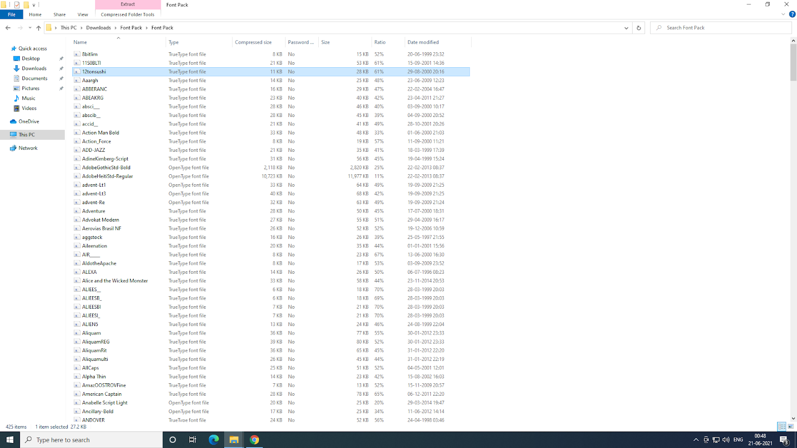
1. Unzip the ZIP file
Start by unzipping the ZIP file containing your font, if needed. For reference, fonts look like this:
2. Use VEED’s PRO plan
The advantage of VEED’s PRO plan is that you can load custom fonts and assemble your brand kit. If you go for the PRO plan (pricing $24/mo) you can get custom fonts. Or you can use the top free 7 fonts available with the free version of VEED.
3. Access the Brand Kit
Click on ‘Brand Kit’ to the right-hand side of your workspace.
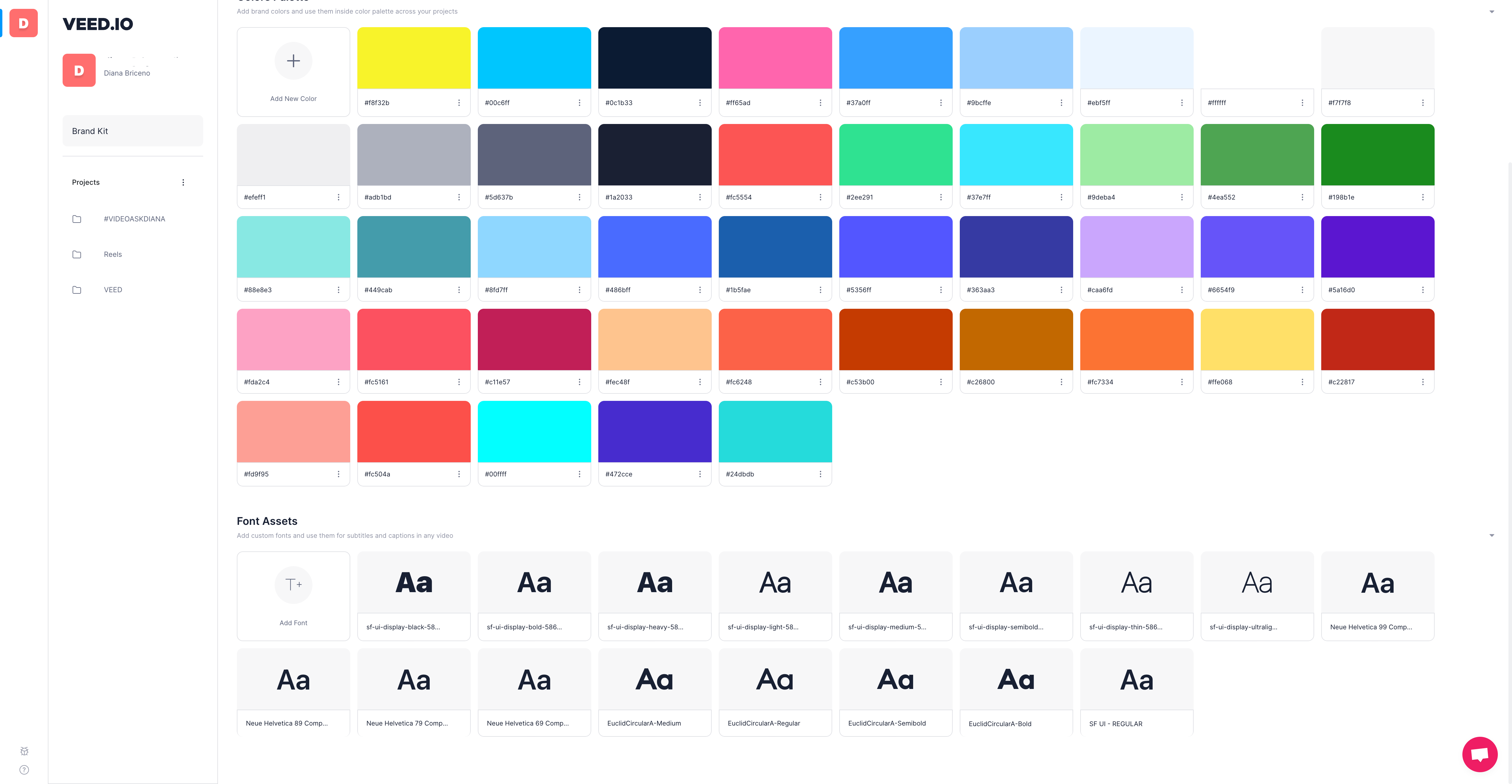
4. Go to Font Assets
Scroll to where it says ‘Font Assets’ and click on the (+) plus symbol to add a font. Here’s a screenshot for reference:
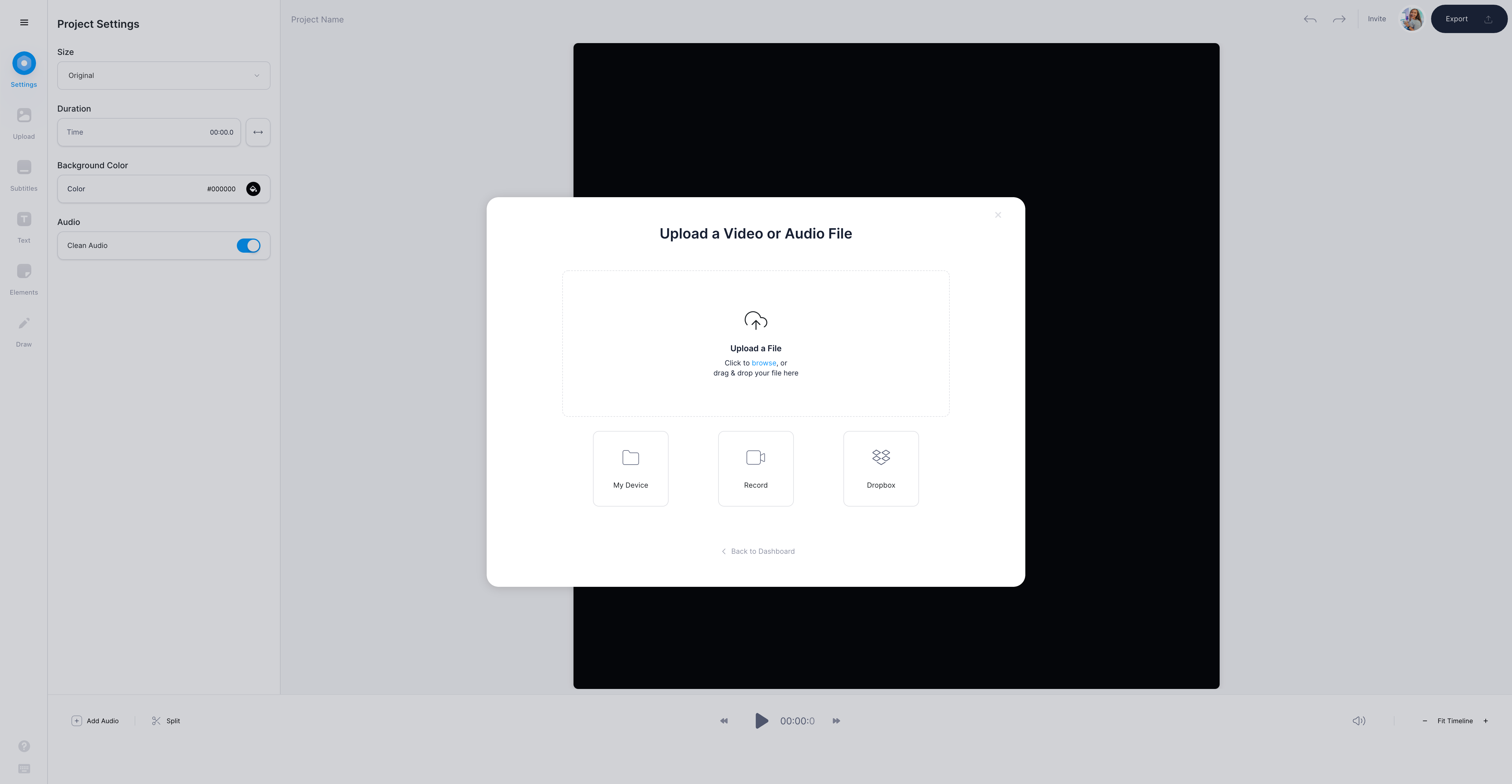
5. Upload your Video
To add subtitles, upload the video that you want to add subtitles to. You can simply drop in a Dropbox link, upload files to your PC or add YouTube video links.
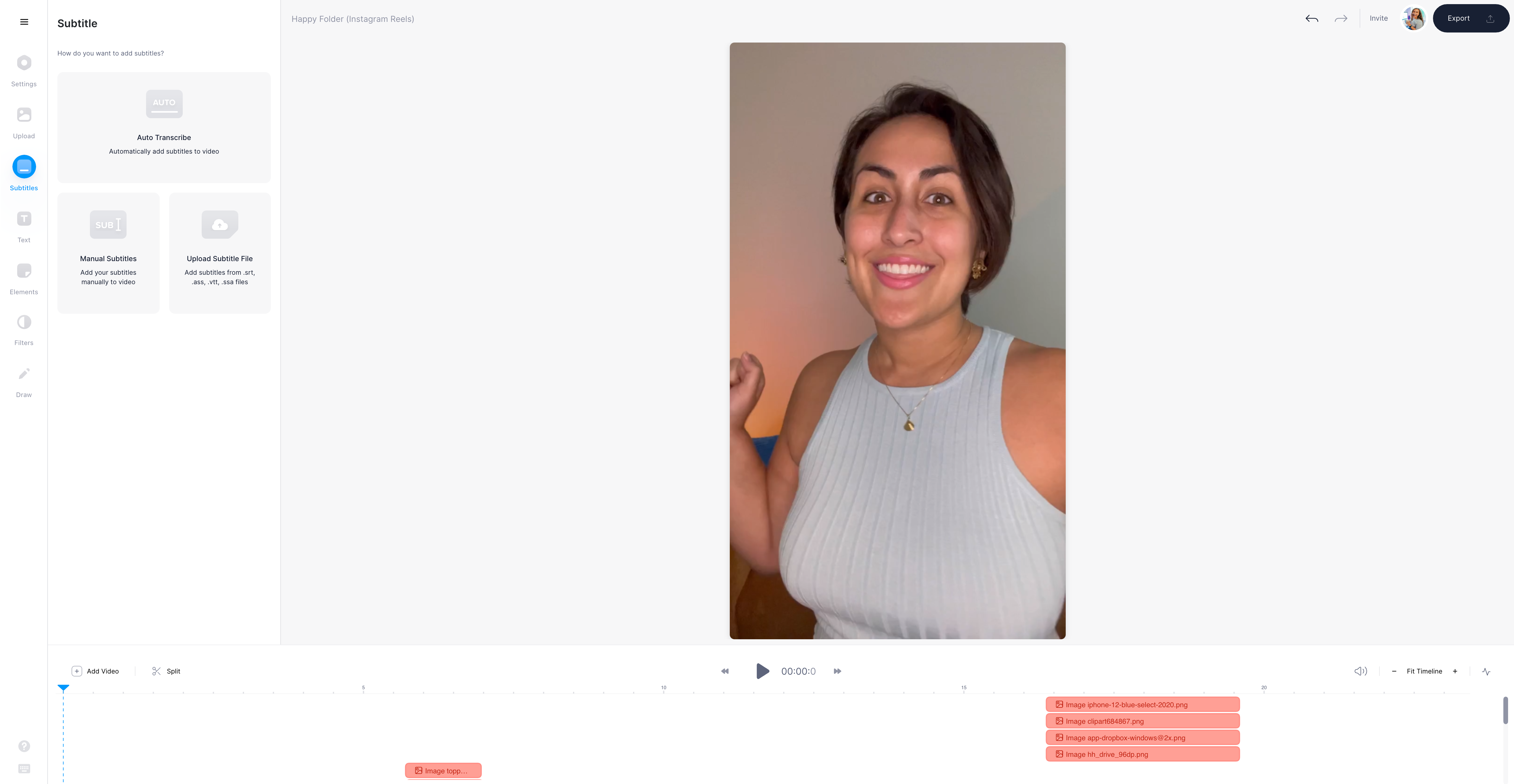
6. Pick Between Auto, Manual, and File
Go to the subtitle button in the left-hand toolbar and choose from automatic subtitles, manual subtitles, or subtitles from an external file. VEED accepts these filetypes: SRT, ASS, VTT, and SSA.
7. Verify and Check Accuracy of the Subtitles
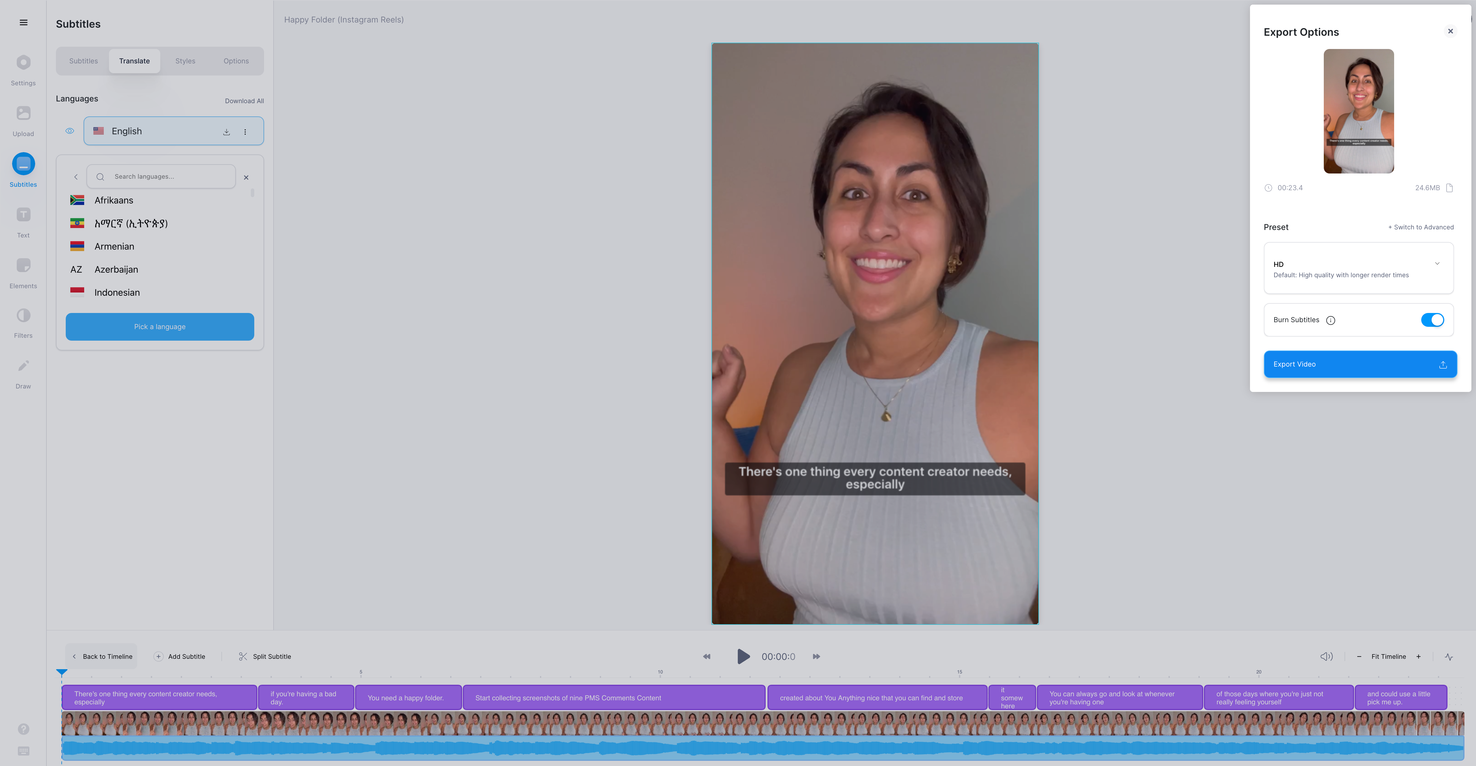
Once you pick the subtitle or the closed captions you need to verify them for accuracy. You can also translate your subtitles to any language with VEED. In the Translate tab, you can see the language drop-down menu. Choose your language and VEED translates these subtitles for you.
8. Download the Final File
Hit the export button on the top right-hand corner to download your video.
How To Style Subtitles with VEED
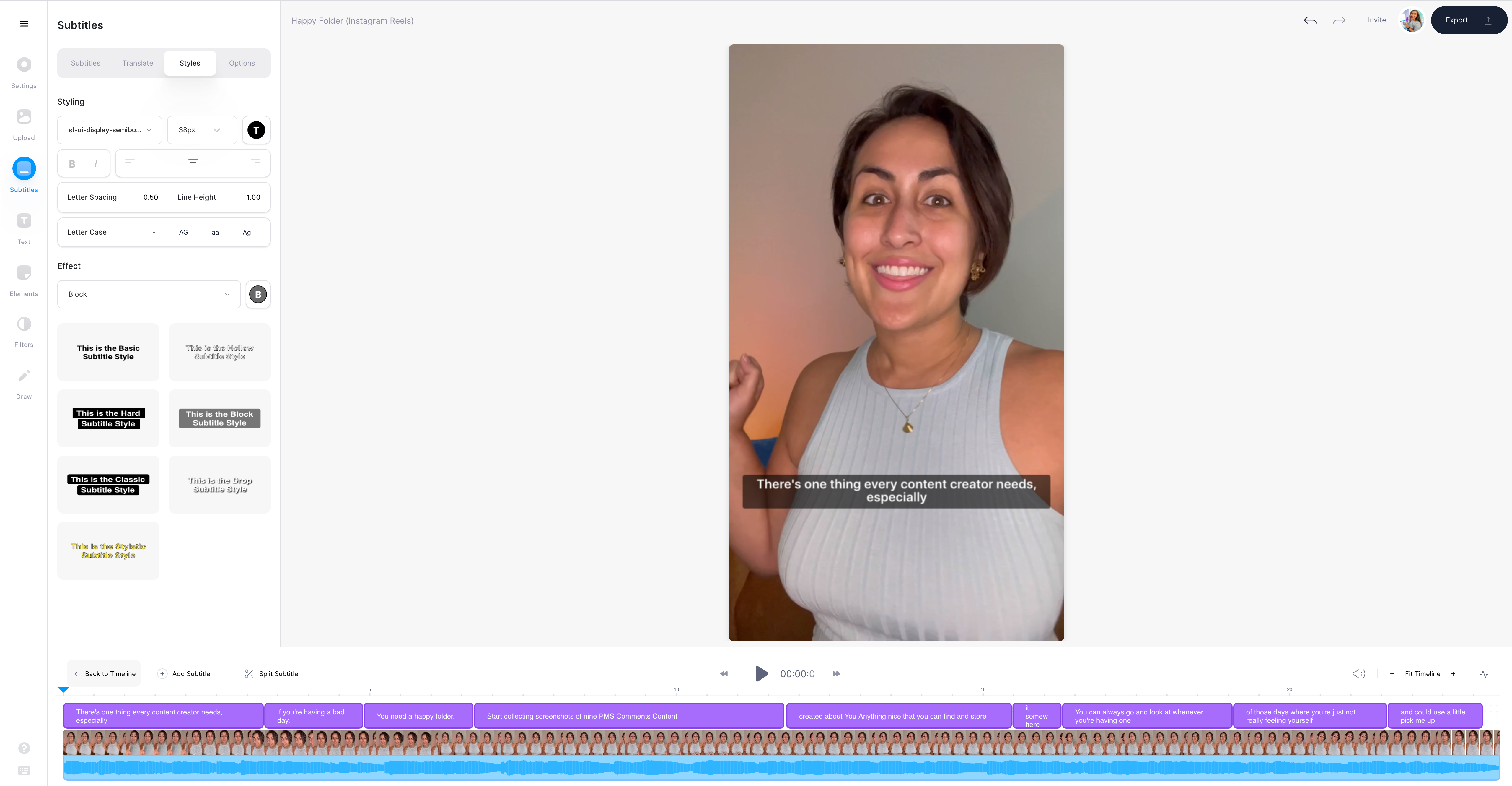
1) Under Subtitles in the Left Toolbar, go to Styles
Once you have generated the subtitles, click on Styles under the subtitle editing panel. You get a drop-down menu to choose your custom font from.
At this point, you customize your subtitle color, backdrop, line height, and letter spacing for better readability. In the next section, we’ll talk about formatting.
Here are advanced VEED subtitle editing tools, go to the subtitle button in the left-hand toolbar and click on styles.
You get to choose from a number of options, beginning with fonts to letter spacing.
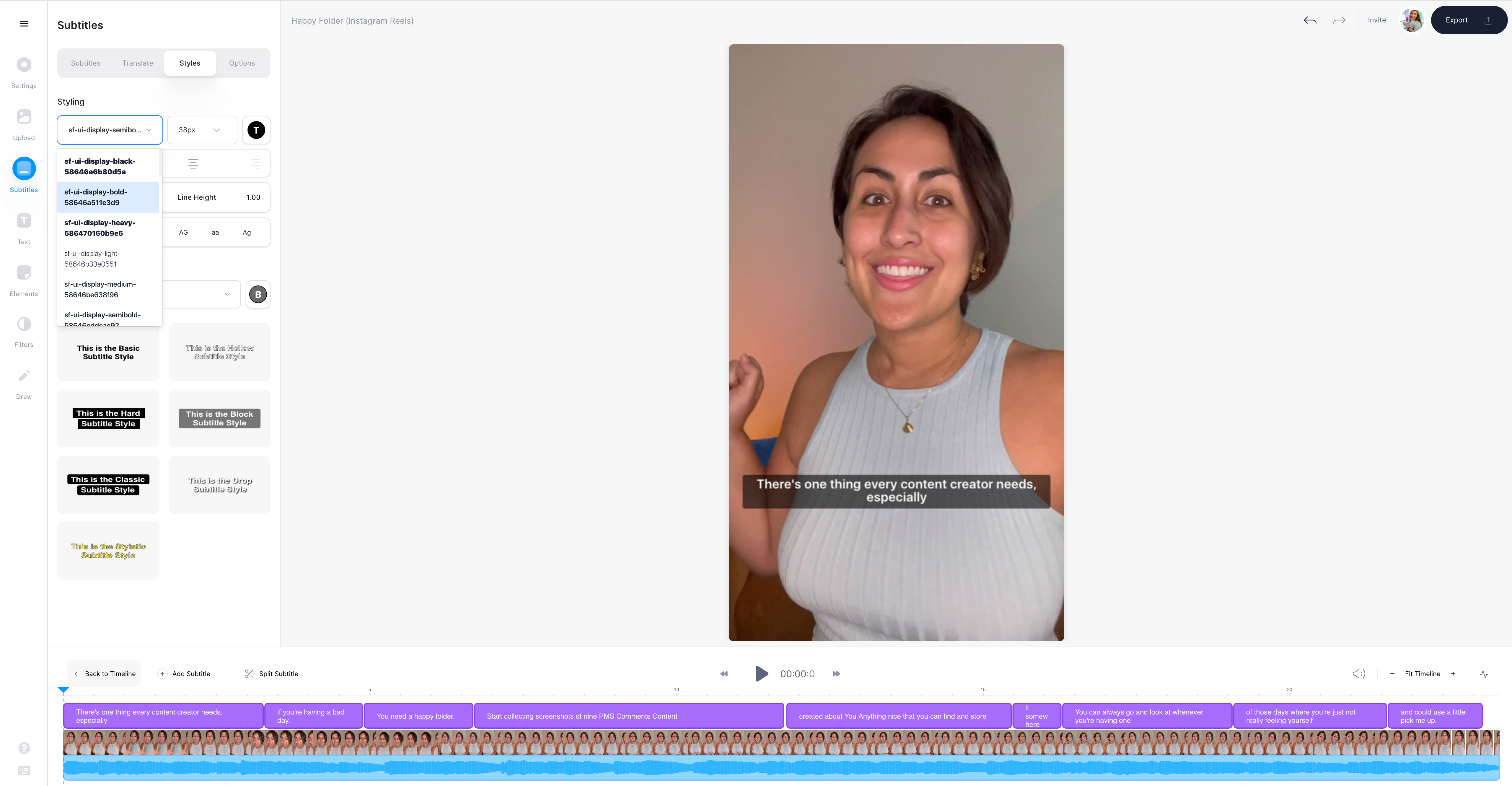
2) Change Font from Choices on VEED or Upload your Branded Fonts
To get the best subtitle you need to compare different fonts. The good news is: VEED supports a number of fonts. All you need to do is test them out with a PRO account. Another option is to upload custom fonts and free fonts that can help you achieve the desired look and feel for your projects. You can use branded fonts as well.
Regardless of choice for subtitles, the text must be easy to follow especially on lower resolution screens.
You need a balance between aesthetic fonts and readable fonts.
Tap the drop-down menu that suits the project best. I’d recommend exporting a few videos with a few fonts to find out what you ideally want.
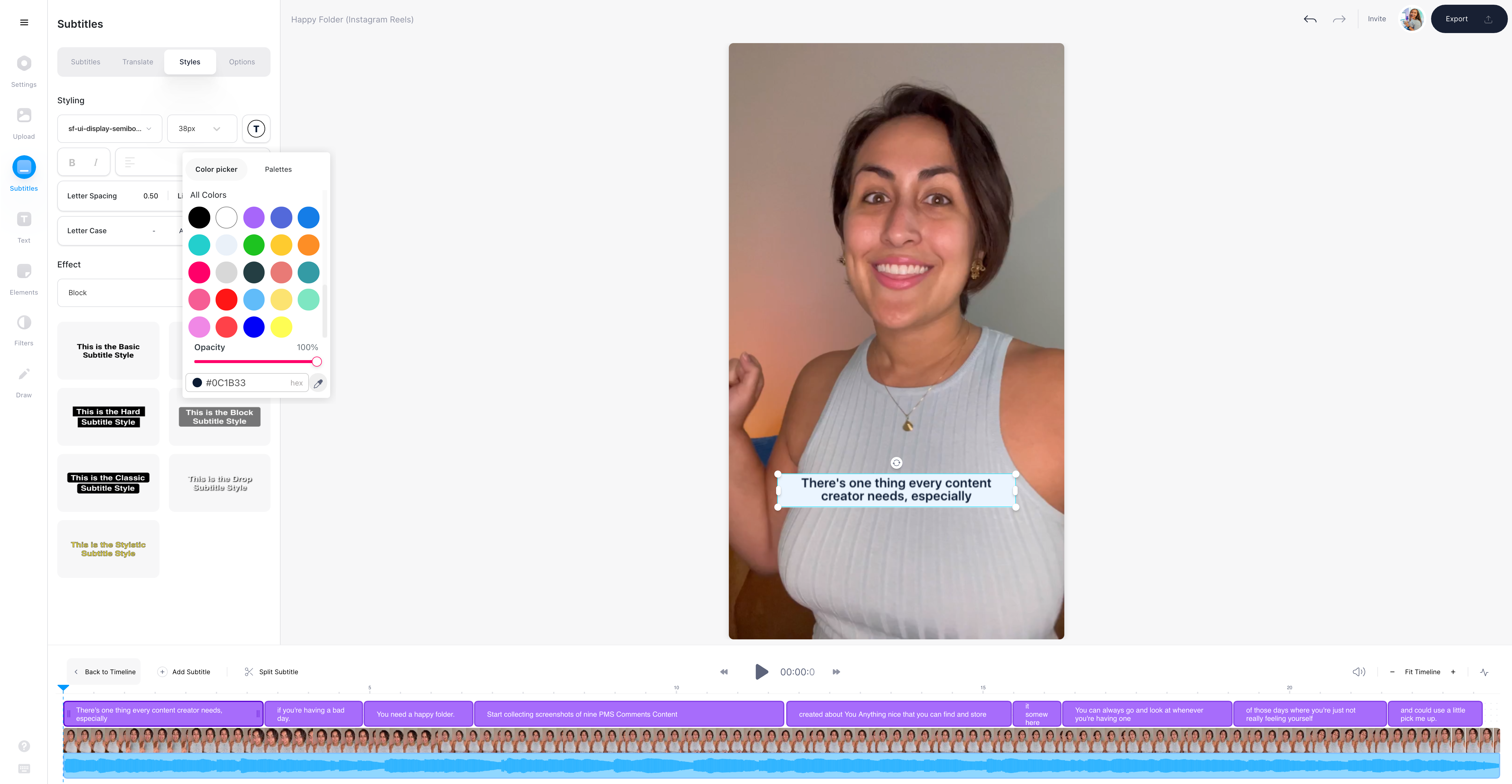
3) Font Size and Color
On the styles menu, you can choose the sizing for the font. Go to the T-shaped icon right next to the font size drop-down menu. Pick a color from the palette, add a hex color code or use the pipette tool to select a color from your video.
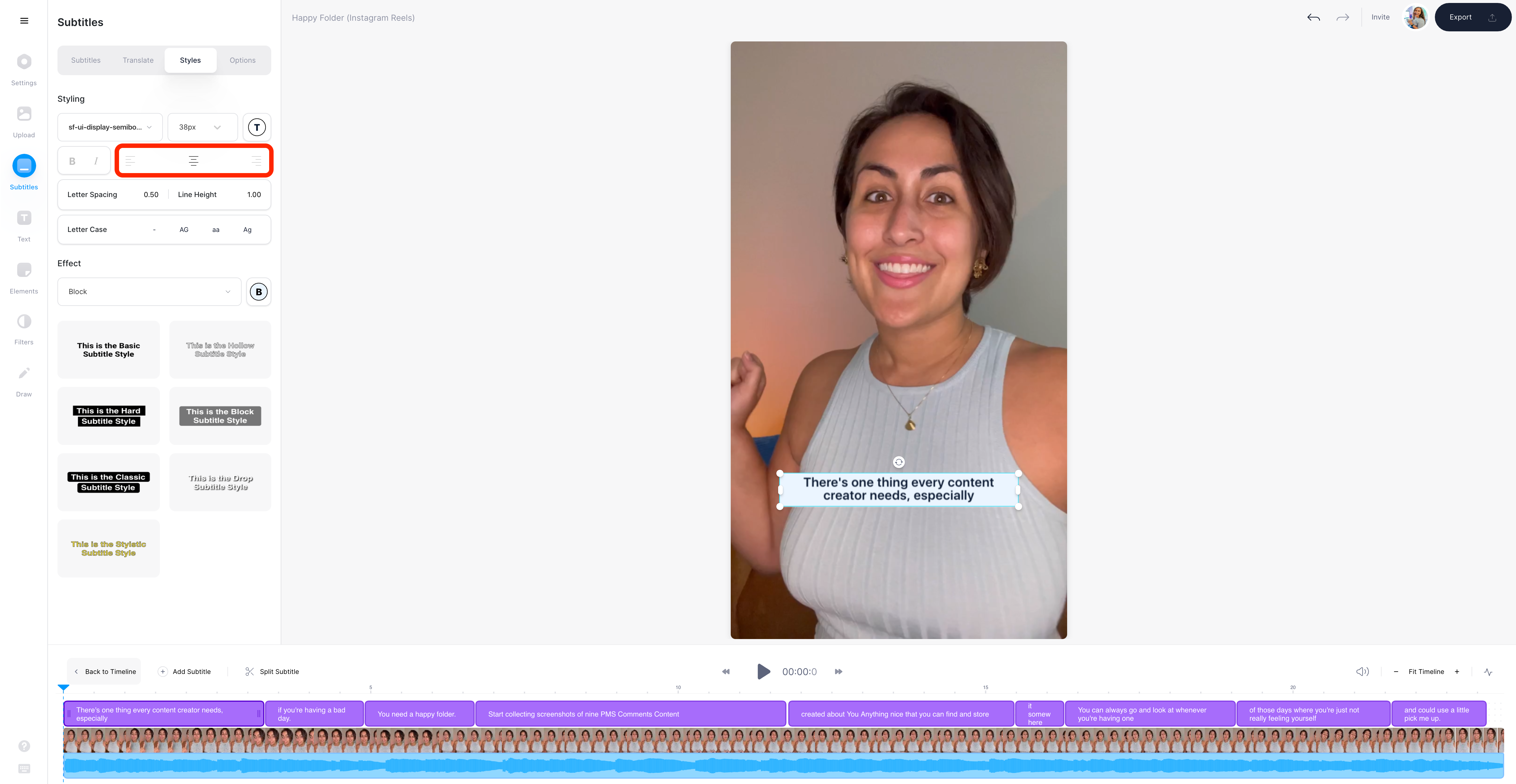
4) Alignment
To add the alignment of the text, go to the styles tab once more and then access the second row.
You get three options to adjust the alignment. Choose the desired option.
5) Letter Spacing, Case, and Line Height
To adjust letter-spacing or line height add the desired numbers and VEED does that for you automatically. You can also choose from lower case, capitals, or camel case.

6) Add Different Effects
To add effects go to the effect selector under the text styling options
Just tap on the chosen effect to apply.

Remember that the ability to add subtitles is just one feature that VEED has. It’s an easy-to-use but powerful video editor on the cloud with which you can:
- Translate subtitles
- Add music and audio visualizers
- Add progress bars
- Resize video for all major social platforms
- and even create, edit and share screen recordings
Best Practices to Format Readable Subtitle Fonts for Video
Picking the right font is only half the work. The next thing you need to do is format things so that what’s written is easy to read without being too distracting or fading into the background.
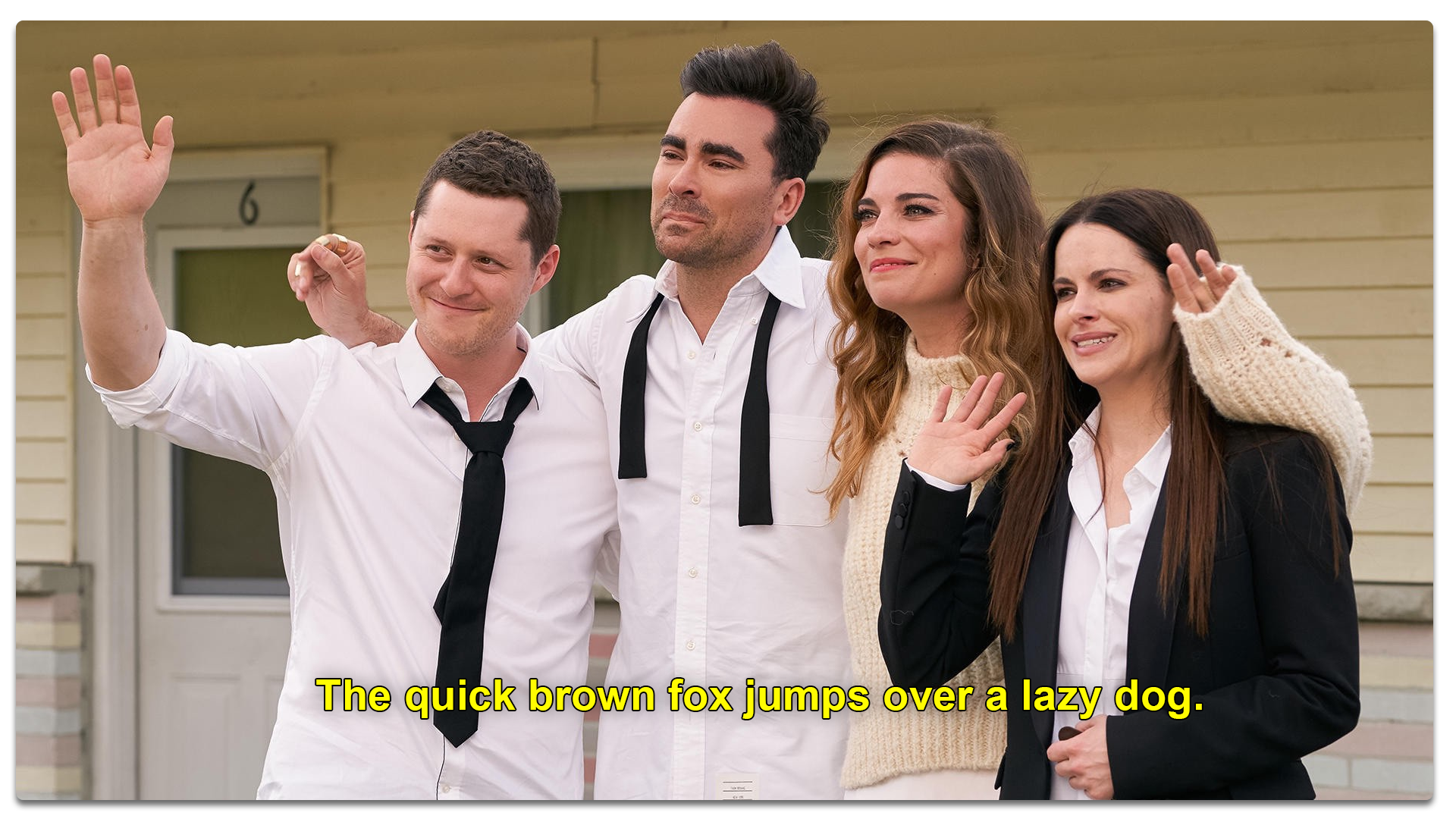
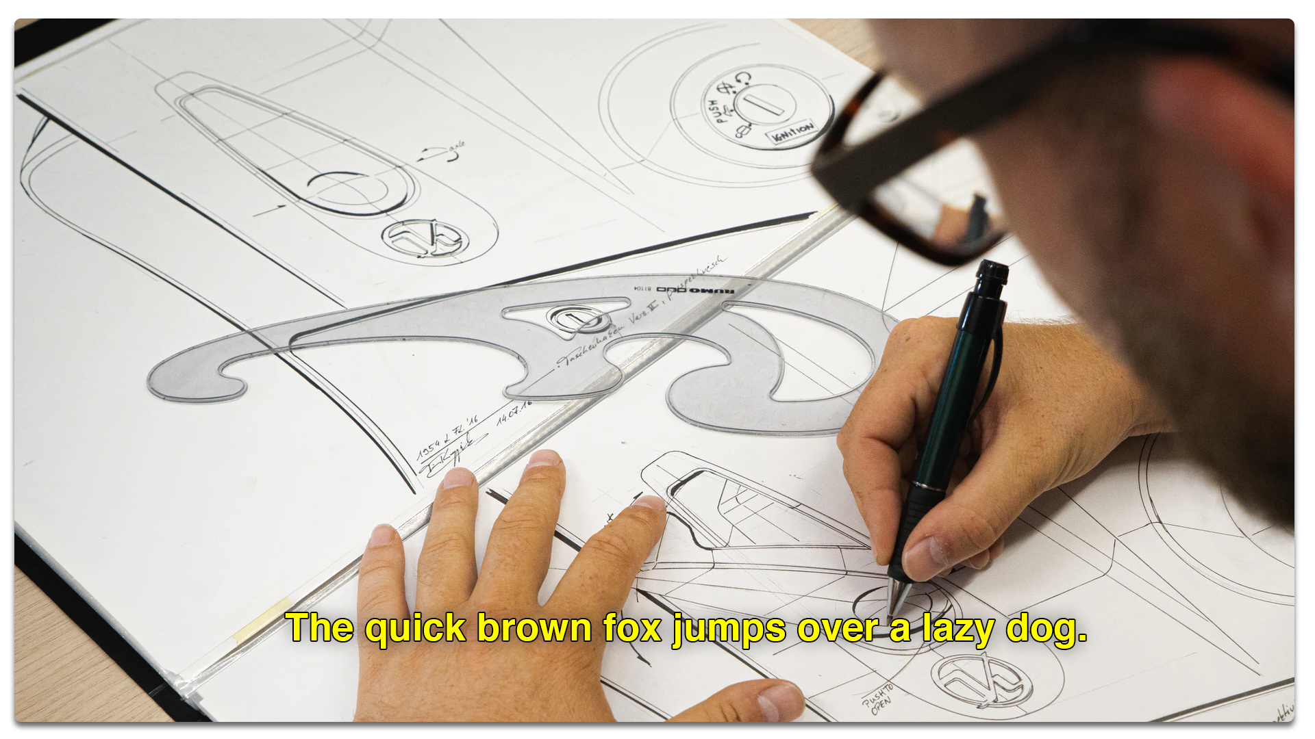
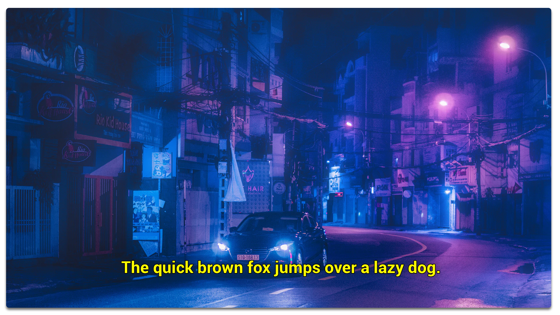
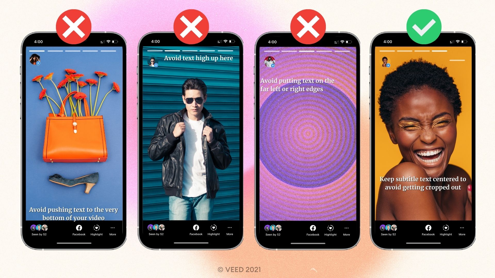
- Alignment: Align the subtitle text to the left. Avoid positioning text on the far left or right as well as the upper or bottommost part of the screen which may cause your text to get chopped off the srceen.
- Font size: The captions should be big enough to be understandable to the viewer without making them squint or so massive they take up the whole screen.
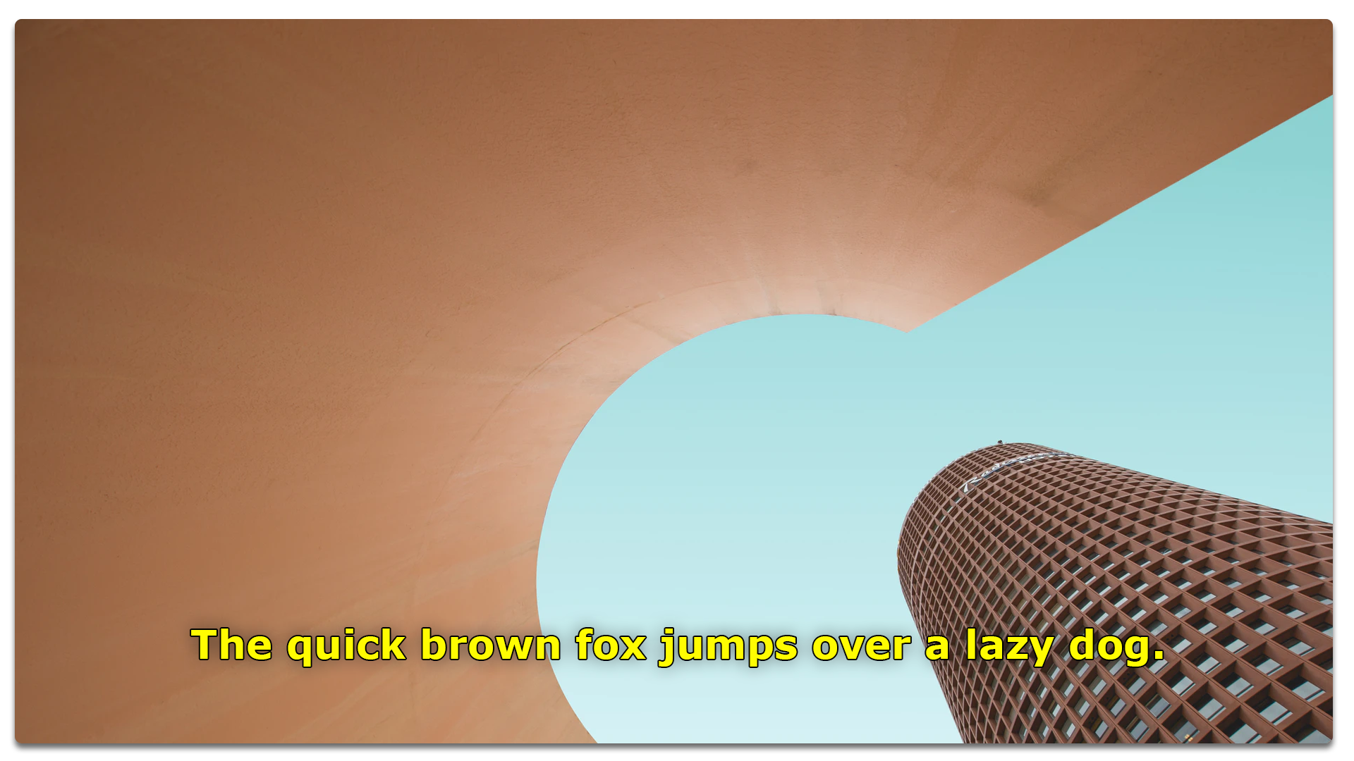
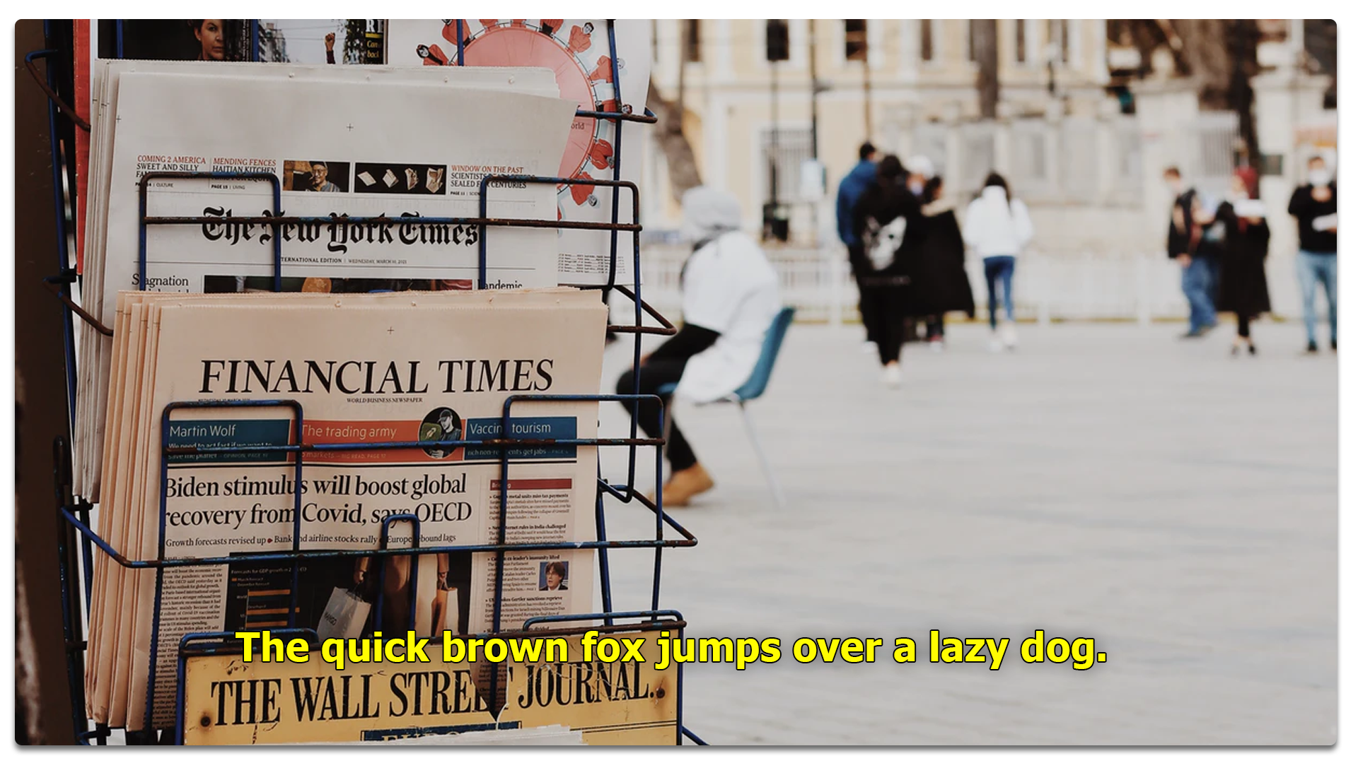
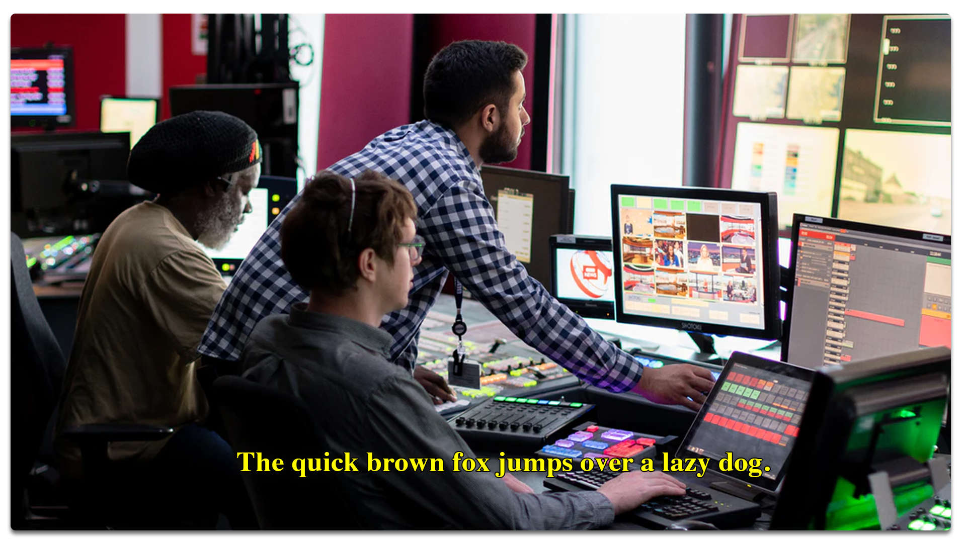
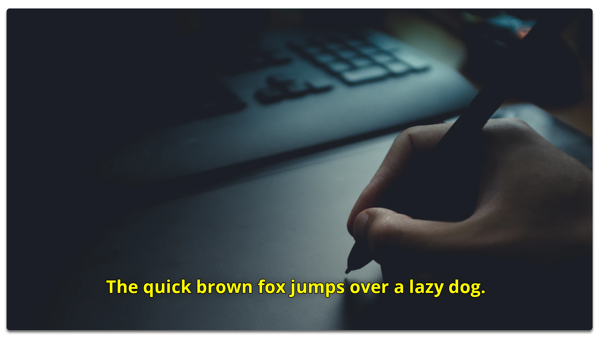
- Font color: High contrast color choices are perfect to make sure people can read your subtitles.
- Video resolution: Make sure to export your video in a high enough resolution so things aren't pixelated (and therefore hard to read).
- Video background: The video background shouldn’t clash with the font color. Hide distractions behind the text. You can also add a background color to fix this and add contrast.
Ready to pick a font for your next video?